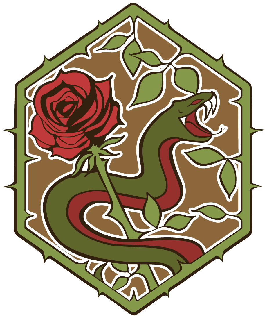
6-Color
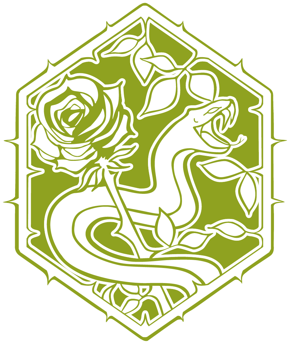
2-Color
Sketch
Color Palette
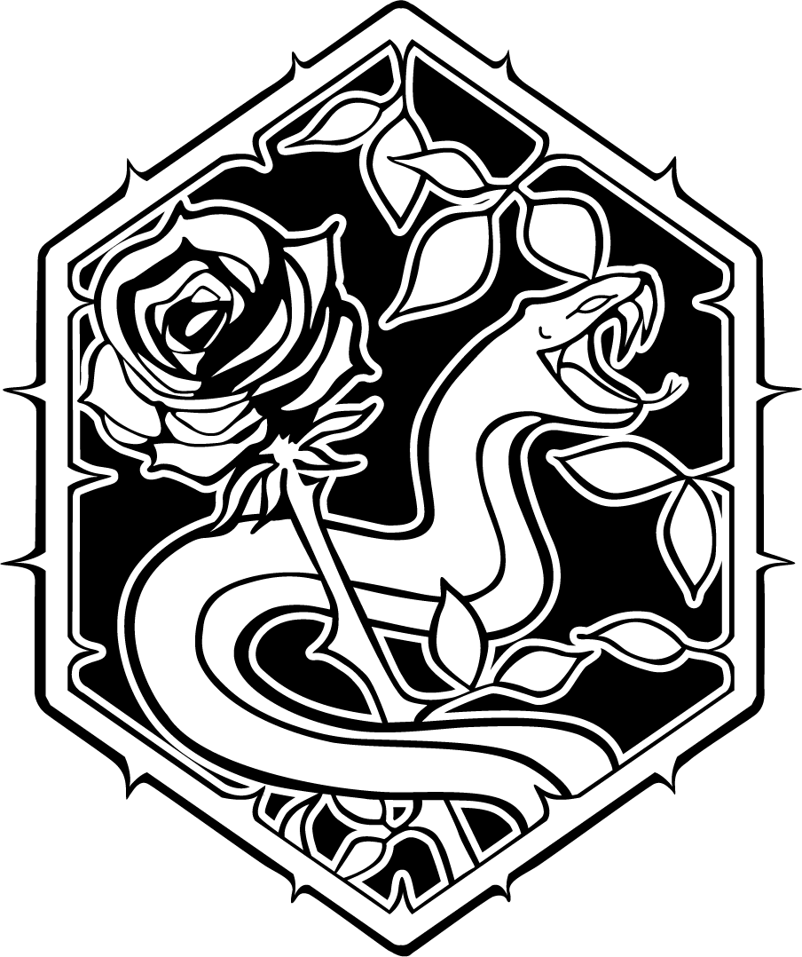
While designing my logo for ThornEnvy, I had many steps in the process.
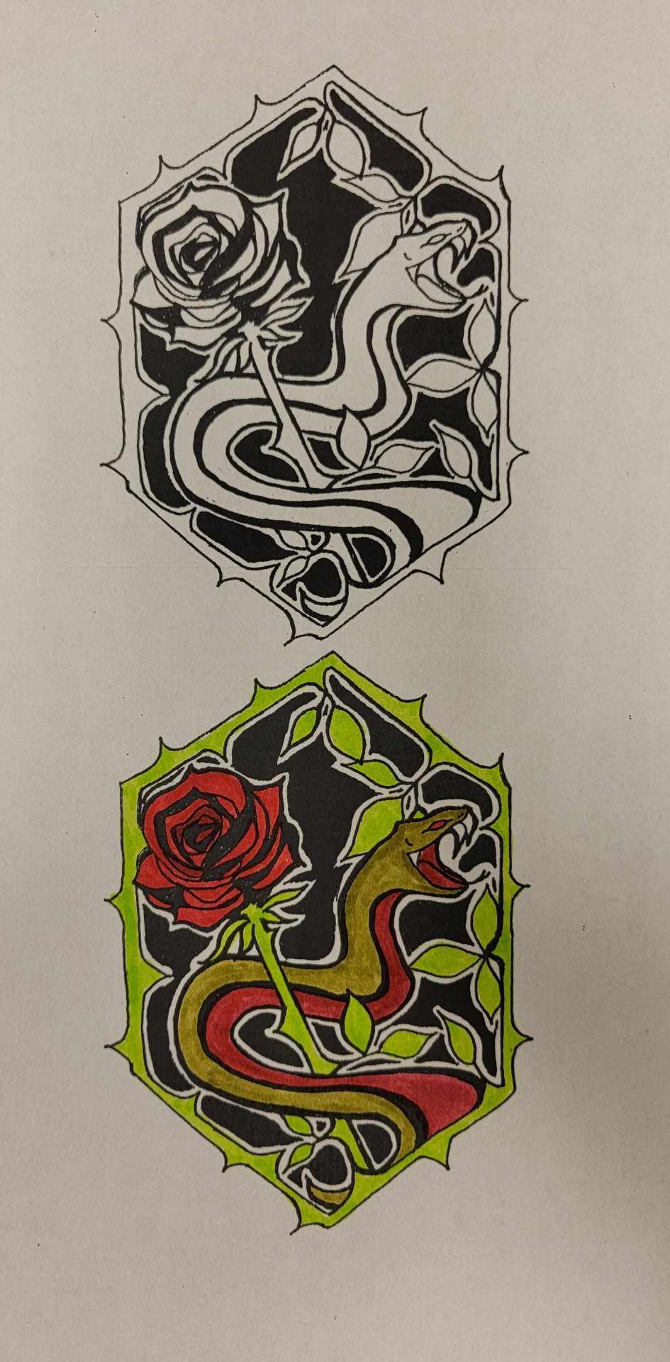
First, I start with a simple pencil sketch with many variations of the same idea. I wanted to keep in mind how it will look as a stencil, how it would look on a shirt, or even how it would look as a wax seal.
Then once I have the design, I ink it with various ink pens. I keep the idea of strokes in mind so that when I transfer it to digital, I won't have too many revisions in the final project.
Using Adobe Illustrator, I upload an image of my sketch and trace it as similarly as possible with the pen tool making each shape.
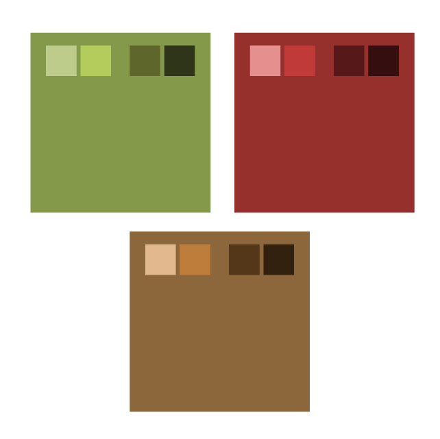
My last step is to make the color palette that fits for not only the logo, but the entire brand. With the approach I used, green and red are complimentary. By mixing both base colors I have the third color of brown.
I replaced using black with different shades of brown to line the piece and overall it softens the design.